the social cuppa brand
Brand guidelines
Everything you need to show off The Social Cuppa: logos, colours, fonts, and the badge to add to your site when we feature you.
been featured? show it off
Featured on The Social Cuppa
If you've written for us, or we've featured you or your business, add this badge to your website, email signature or media page. Copy the code and paste it into your site, or download the image.
- Show the badge at 160px wide or bigger so the words stay readable.
- Link it to The Social Cuppa (the code does this for you), or straight to your article.
- Please don't recolour, stretch or redraw it.
Logos
The logo is lowercase, the "o" in social is a cup seen from above, and "cuppa" always sits on the lemon swipe. Pick the version that suits your background.
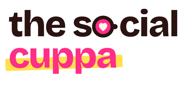
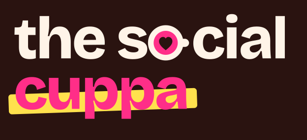

Horizontal logo
For website headers, email headers and anywhere short and wide.


Spill the Tea sticker
A campaign badge for graphics, merch and the newsletter. Not a logo.
Do
- Leave clear space around the logo the width of the cup
- Use the reverse logo on dark backgrounds
- Keep it at least 120px wide (30mm in print)
Don't
- Recolour, stretch, outline or add a soft drop shadow
- Put the primary logo on pink, cobalt or a busy photo
- Retype the name in another font
Favicons
The cup on its own, in three colourways.





Typography
Three free Google Fonts, so they work everywhere from WordPress to Canva.
Bricolage Grotesque
Headlines. ExtraBold 800 and SemiBold 600, tracked in tight.
Get it on Google FontsInstrument Serif
The italic accent. One or two lowercase words, never a whole headline.
Get it on Google FontsSpill the marketing tea
Bricolage Grotesque 800 · 56pxHooks are doing the heavy lifting
Bricolage Grotesque 800 · 36pxThe three-second rule
Bricolage Grotesque 600 · 24pxthe social
Instrument Serif Italic · 32pxPour a brew, open your analytics and let's talk about what's really working.
DM Sans 400 · 18pxHot Take
DM Sans 700 · 13px · capitalsColours
Built to clash on purpose. On any page or graphic aim for roughly half milk, a quarter pink, and a little cobalt, espresso and lemon. Pink always wins the room.
Cuppa Pink
#FF2E88 · RGB 255, 46, 136
The hero colour. Logo, buttons, big fills.
Electric Cobalt
#2B4BFF · RGB 43, 75, 255
The clash colour. Feature blocks and secondary buttons.
Butter Lemon
#FFE14D · RGB 255, 225, 77
Stickers and highlighter swipes. Never text.
Blush
#FFD6E8 · RGB 255, 214, 232
Soft panels and quotes.
Espresso
#2A1310 · RGB 42, 19, 16
Text, outlines and hard shadows.
Milk
#FFF4E8 · RGB 255, 244, 232
The page background.
Pink (text)
#B5005B · RGB 181, 0, 91
Pink for small text and links.
Text on pink is always espresso, never white. Small pink text uses Pink (text) so it stays readable.
How we sound
Three words to check everything against.
Get attention
Open with the point. Big statements, strong headlines, opinions we can back up.
Earn the click
Be specific. Real numbers, real tools, something the reader can use the same day.
Make friends
Like advice over a brew. Celebrate people, credit contributors, tease the algorithm, never people.
Questions about using the brand? Email hello@thesocialcuppa.com.