When you’re starting a business, getting a logo can feel like one of the first things you need to tick off the list.
You need something for your Instagram profile, your website and probably a business card. So, it makes sense to start there.
But when a designer talks about creating a brand identity, what are you actually getting? And why is it worth investing in more than a logo?
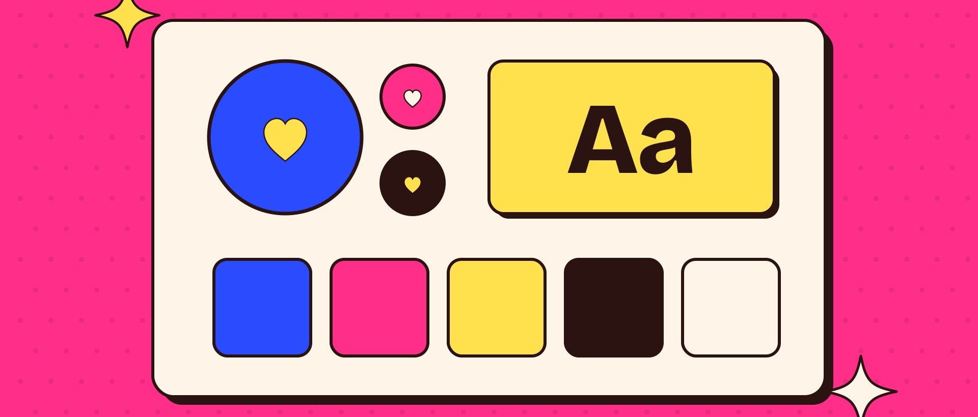
A brand identity gives your business a visual foundation. It brings together the elements that help people recognise you and gives you a clear direction for how your business looks across different places.
For a small business owner juggling everything else, that direction can be helpful. You have something to come back to each time you need to create a post, update your website or put together a document.
Here’s what a brand identity can include, how those pieces work together and why they matter.
A brand identity gives your business a visual foundation.
It starts with understanding your business
Before I start exploring colours, fonts or logo ideas, I want to understand the business and the person behind it.
What do you do? Who do you want to reach? What matters to you? What kind of experience do you want people to have when they work with you?
These conversations help give the design a purpose.
Two businesses might offer the same service but have completely different approaches. One might be playful and energetic, while another feels calm and considered. Their identities should reflect those differences while also making sense to their audiences.
Your own preferences are part of the conversation, too. You should feel connected to your brand. Alongside that, we need to consider what the design communicates to the people you want to reach.
This is the human side of design that I love. Getting to know someone, hearing why they started their business and understanding where they want to take it all help shape the direction.
Depending on the scope of the project, this foundation might involve a questionnaire and discussion, or a more detailed strategy process. Either way, the design should have a clear reason behind it.
A logo suite gives you options
Your logo is a central part of your visual identity. But you’ll often need more than one version of it.
Think about the difference between a website header, an Instagram profile image and a narrow product label. They’re all different shapes and sizes, so the same logo won’t necessarily work well in each space.
A logo suite might include your main logo, an alternative layout and a smaller supporting mark or submark. You may also need versions for light and dark backgrounds.
These are variations of the same identity, designed to work together.
For example, your main logo might sit horizontally, while an alternative version stacks the wording to fit a smaller space. A simplified mark might work where the full business name would become too small to read.
Having these options means you can choose a version that suits the space, without squeezing, cropping or rearranging your logo yourself.
Exactly what you need will depend on your business and where the logo will be used. The aim is to give you a practical set of options.
Colour creates a recognisable thread
Colour is often one of the first things we notice about a business.
A considered palette helps create a recognisable thread across your website, social media, printed materials and other places people interact with you.
Choosing those colours involves thinking about the personality of the business, the audience and how the colours will work together in practice.
You might have a main colour that becomes strongly associated with your business, supported by lighter tones, darker shades and a few complementary colours.
Each one can have a role. Some might work well for backgrounds, others for headings or smaller details.
It’s also important to consider readability. A combination can look lovely as a pair of swatches but become difficult to read when used for text.
Having a defined palette, along with the relevant colour codes, makes it easier to keep things consistent when you’re working across different programs or handing a project to someone else.
Typography helps set the tone
Fonts have a big influence on how a business feels.
Some can feel expressive and full of personality. Others are more understated. Your type choices help support the overall direction of your identity, while making your information clear and easy to read.
A typography system usually explains which fonts to use for different purposes, such as headings and body text.
This takes some of the guesswork out of creating new materials. You have a starting point, rather than scrolling through hundreds of fonts every time you need to make something.
Practicality matters here, too. Can you access the fonts in the programs you use? Do they require a separate licence? Will they work for longer documents as well as short headlines?
These details are worth discussing during the design process so you understand what you’ll need going forward.
Supporting elements help bring it together
Some identities also include graphic elements, patterns, illustrations, icons or a direction for photography.
These give you more ways to express your brand without putting your logo on every available surface.
A particular approach to imagery, for example, can help your website and social media feel connected. A supporting graphic might become a familiar part of your packaging, presentations or printed materials.
Not every business needs all of these things. A simple identity can work beautifully when it has the right elements and they’re used thoughtfully.
The scope should reflect what will be useful for your business. It’s always worth checking what’s included in a proposal, because brand identity packages can vary between designers.
Guidelines and files help you use your identity
Once the design is finished, you need to know how to use it.
Brand guidelines bring the key information together. They might explain which logo version to choose, how much space to leave around it, your colour codes, your font choices and how supporting elements should be used.
They give you a reference when you’re creating something yourself and they’re helpful when other people work on your business.
Your logo files matter, too. Different formats suit different uses, so you’ll need files appropriate for things like websites, documents and professional printing.
I include a handover guide with useful tips to help clients understand their files and feel more comfortable using them. Receiving a folder full of unfamiliar formats can be overwhelming, so I want that next step to feel approachable.
A finished identity should be something you can confidently put to work.
Your everyday materials bring the identity to life
Business cards, letterhead, email signatures, signage and social templates are all places where your identity can be applied.
These may be included in a package or quoted separately, depending on what you need. They’re worth discussing early so you understand both the scope and the overall investment.
I recently worked with a client who already had their branding in place but needed help carrying it through to their everyday business materials. I designed their business cards, letterhead, signage and email signatures and prepared their logo for use on an online platform.
Working with their existing branding, I brought those pieces together so everything felt like it belonged to the same business.
They already had a foundation that worked. They needed support making the most of it.
It’s a good reminder that investing in your brand can look different depending on where your business is at.
So, why is it worth investing in?
Part of the value is having an identity that has been considered specifically for your business. There’s thought behind the choices, from how your logo works in different spaces to whether your fonts are practical and your colours are readable.
There’s also the benefit of having a clear direction.
When you’re doing everything yourself, it’s easy to spend a lot of time questioning small design decisions. Does this font work? Should I use another colour? Why does this document feel different from my website?
A cohesive identity gives you a foundation for those decisions. It can make creating new materials more straightforward and help other people work consistently with your business.
For your audience, that consistency helps build familiarity. When someone moves from your social media to your website and then receives a proposal or email, the experience feels connected.
Good design also helps present your information clearly and gives people an impression of the care you put into your business.
Of course, branding works alongside the quality of your product or service, your communication and the experience you provide. Together, those things shape how people come to know and trust you.
Start with what your business needs now
You don’t need to invest in every possible brand element at once.
If you’re starting fresh, focus on building a useful foundation and the materials you need most. If you already have an identity, take a look at what’s working before deciding what needs to change.
Sometimes your business has evolved enough that a new direction makes sense. Other times, your existing logo, colours and fonts are still a great fit and you just need help making everything feel cohesive again.
A good place to begin is by looking at your website, social media and everyday documents together. Do they feel connected? Do they reflect your business today? Do you know how to create something new without starting from scratch?
Those answers can help guide your next step.
For me, a worthwhile brand identity is one that feels considered, reflects the business behind it and works in everyday use. It gives you the tools to present your business with confidence and a foundation you can keep building on as you grow.