Header tags are one of those website basics that everyone has heard of and almost nobody uses properly. I see pages with five H1s, pages with none, and pages where someone has picked H4 for a heading because they liked the font size. If you write blogs, landing pages or website copy, getting your SEO header tags right is a quick win that helps readers, helps people using screen readers and gives search engines a clearer picture of your page.
I’m Head of Web at Delivered Social, and I spend a lot of time tidying up headings on sites we take over. Here’s the plain-English version.
What are SEO header tags?
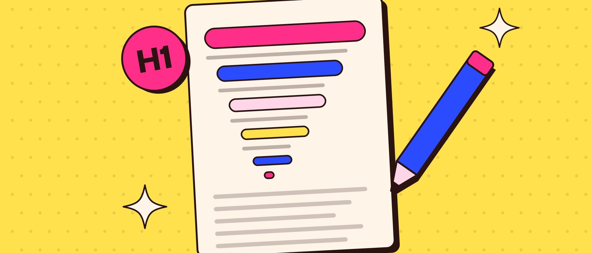
Header tags are the bits of HTML code that mark text as a heading. They run from H1 to H6. H1 is the main title of the page, H2s are the main sections, H3s are sub-sections inside an H2, and so on down to H6, which you’ll rarely need.
Think of it like the contents page of a book. The H1 is the book title. H2s are chapters. H3s are the sections within a chapter. If someone only read your headings, they should still understand what the page covers and how it’s organised.
The key thing to understand is that a heading is about structure, not style. Making text bigger and bold doesn’t make it a heading. Choosing “Heading 2” in your editor does. And choosing a heading level because it looks nice is how pages end up in a muddle.
One H1 that says what the page is about
My rule is simple: one H1 per page, and it should clearly describe the page. For a blog post, that’s usually the title. For a service page, it might be “Wedding Photography in Surrey” rather than “Welcome!”.
In most WordPress themes, the page or post title is automatically turned into the H1. That catches people out. They type the title in the title field, then add another big heading at the top of the content as an H1 too. Now there are two. When you’re writing in the editor, start your content headings at H2 and let the theme handle the H1.
Google’s own SEO Starter Guide says there’s no magical ideal number of headings for a page. So a second H1 won’t sink you. But a single clear H1 is good practice, keeps the page easy to follow and makes accessibility checks happier.
How to use H2 to H6 without overthinking it
Below the H1, here’s how I’d use the rest:
- H2 for your main sections. Most blog posts need somewhere between three and seven. Each one should make sense on its own.
- H3 for points inside a section. Steps in a process, items in a comparison or questions within a topic.
- H4 only when an H3 needs splitting. Useful on long guides. Most pages never get this far.
- H5 and H6 hardly ever. If you need them, the page might be trying to do too much. Consider splitting it.
Try not to skip levels as you go down, so don’t jump from an H2 straight to an H4. Google’s guide is honest that heading order doesn’t matter for Google Search itself. But it also points out that headings in a sensible order are fantastic for screen readers, and people using those tools often jump from heading to heading to find their way round a page. A skipped level makes it look like something is missing. Do it properly for them and you’ll have a tidy page for everyone else too.
Pick a heading for what it means, never for how it looks.
If you don’t like how a heading level looks, change the style in the theme settings, not the level. That’s a five-minute job for whoever looks after your site, and it fixes the look everywhere at once.
Writing headings that help readers and search
Header tags are part structure and part copywriting. A heading like “Introduction” or “More info” tells nobody anything. A heading like “How much does a new website cost?” tells readers exactly what they’ll get if they keep scrolling.
A few habits that help:
- Be specific. Say what the section is actually about. Clever puns are fine now and then, but clarity wins.
- Use your main keyword naturally in the H1 and at least one H2. Don’t force it into every heading. That reads badly and doesn’t help.
- Use the words your readers use. Question-style headings often match how people search.
- Keep them short. A heading is a signpost, not a paragraph.
There’s a bonus here too. Google says the title links it shows in search results can be taken from a few places on your page, including the title tag and other headings. So a clear, descriptive H1 is a sensible backup if your SEO title isn’t quite right.
What are the most common header tag mistakes?
When we audit a site, these come up again and again:
- Headings used for styling. A quote, a phone number or a button label set as an H2 because it looked bold. Use bold text or a proper block instead.
- Headings hidden in the theme. Footers and sidebars full of H2s and H3s like “Follow us” and “Opening hours”. Ask your developer to change these to normal text where they aren’t really headings.
- A logo as the H1 on every page. Some older themes do this, so every page has the same H1. It’s worth fixing.
- Walls of text with no headings at all. Long posts with nothing to scan are hard work. Break them up.
You can check any page in a couple of minutes. Free browser extensions will list the headings on a page in order, or you can use the list view in the WordPress editor to see the structure of your content. If the outline doesn’t make sense on its own, the page probably needs a tidy.
Good headings won’t rescue a weak article, but they make a good one much easier to read. And if you’re writing copy for social as well as web, the same idea applies: clear signposts keep people with you. Our piece on why your Reels flop makes a similar point about hooks.